Design system page
About the project
I led a project to improve the user experience and way finding on the Atlassian Design System page.
This page has high-volume traffic and is used by Atlassian engineers, designers and third-party apps.
The problem
I led the project to improve the user experience on the Atlassian Design System page so that users were served the right information based on their top tasks.
The previous version of this page was too ‘marketing’ heavy, with content that didn’t relate to what users needed to do. Some participants regarded the marketing content as ‘filler’ and ‘fluff’.
Process
I analysed top tasks from users and data to surface several opportunities for this page to be more efficient for users looking to way find and complete tasks.
I ran and facilitated usability testing. This revealed that many users were getting lost on the homepage and reverting to search. Their top tasks were being buried by ‘marketing speak’ and irrelevant information.
Based on the ‘before’ scores from the 1st testing round, I iterated the content hierarchy on the page, shuffling key site areas higher up the page. I also removed redundant carousels that were not being read, which contained messaging that did not resonate with users. I ensured the promotional block was in a tertiary section on the page, as it was confusing for users being at the top.
I created a ‘before’ and ‘after’ benchmarking score set, in order to gauge the impact of my work. The participants gave honest feedback on the page, and these insights formed the basis for the new iteration of design and content.
Results
Across all three benchmarking areas tested, the revised page improved against the original design.
The page score improved +1.6 points on a 7-point scale for page clarity, effectiveness, and how modern it felt.
Users felt that the page had less fluff, and more intentional and refined content.
What people said about the old design
“I don’t understand what ‘design with elegant foundations’ is about. It seems a bit obvious and confusing. The page feels long.” Senior engineer
“Design with elegant foundations: Not sure what the purpose of this block. It’s useful to sell the value of the design system.” Senior designer
What people said about the new design
“Seems more focused, seems more tailor-made to engineers with less filler." Senior engineer
“Although there's a lot less content, it seems more refined and useful." Senior engineer
"Helps people using the design system to get to where they need to as quickly as they can." Senior designer
"The interactive hero is a bit cool – it's a fun thing to play with. Nothing here feels dated." Senior designer
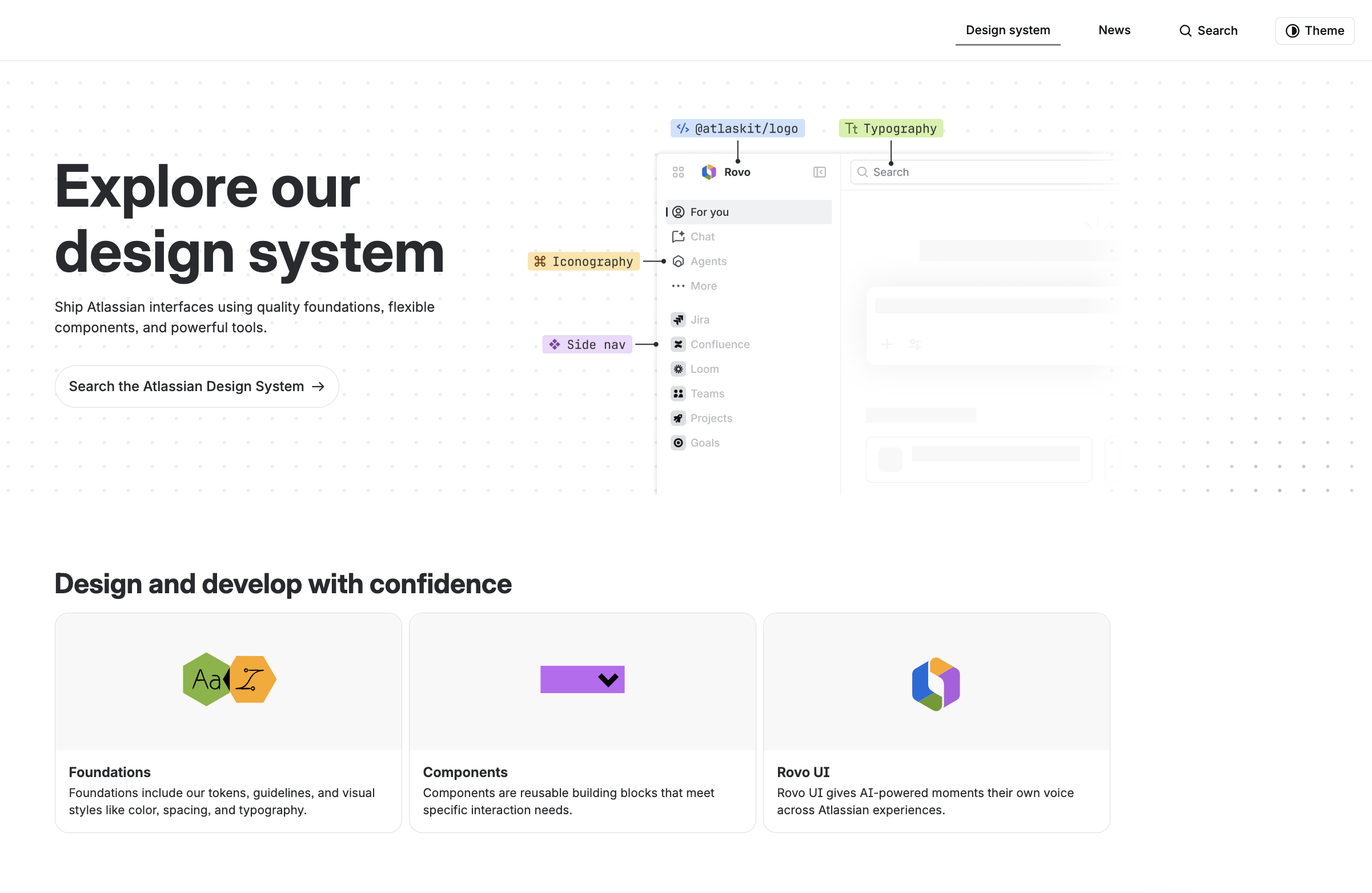
Atlassian Design System page after the changes
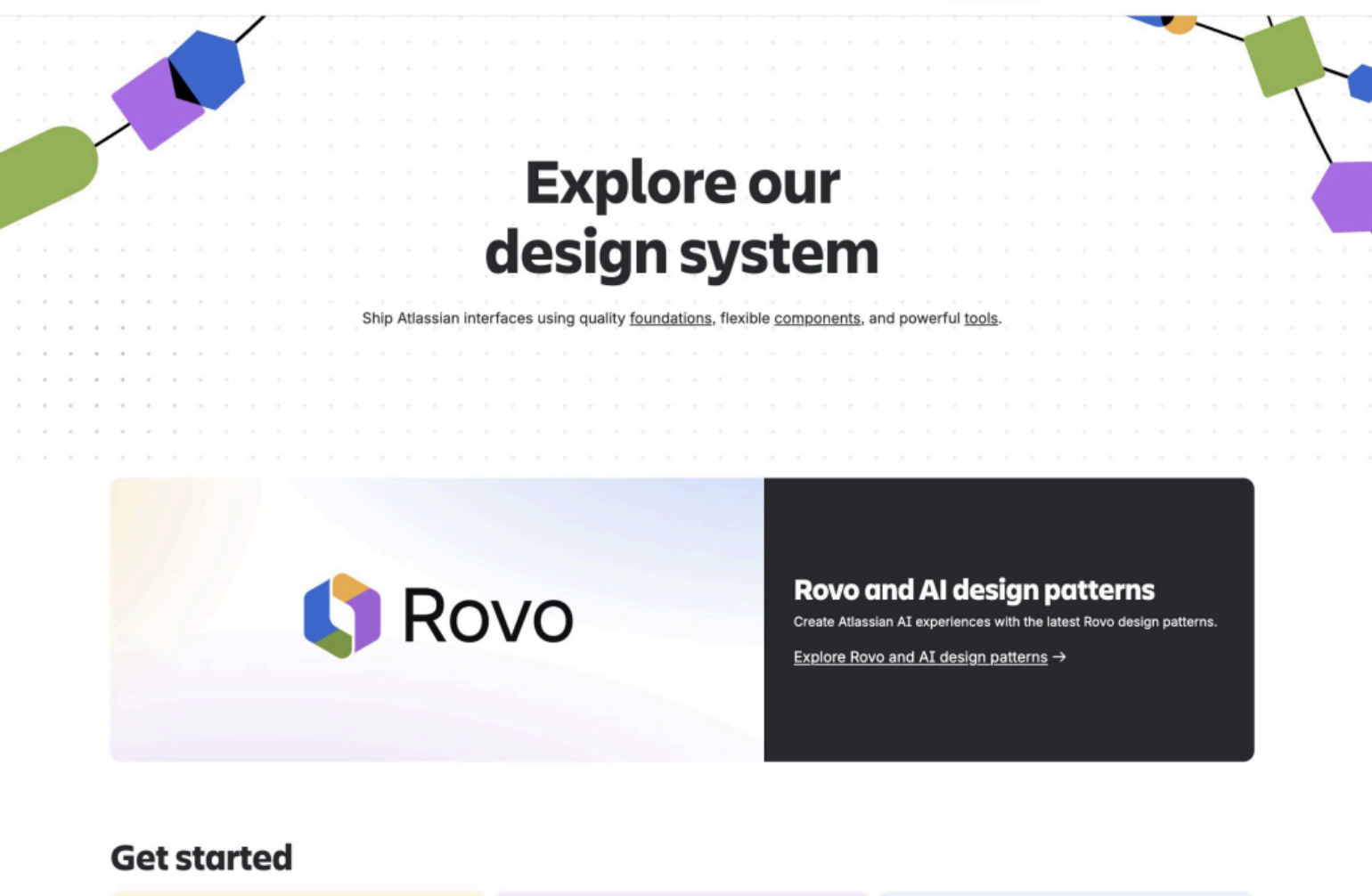
Atlassian Design System page before the changes