Xero website redesign
Before: The Xero website

About the project
I was a core part of the experience team piloting and launching a new xero.com.
I analysed thousands of web pages for migration from Adobe’s old content management version to the latest version.
I worked closely alongside teams across disciplines to constantly improve content with an iterative approach.
The problem
The platform xero.com was sitting on was reaching end of life, and a new strategy and component set was needed.
There had previously not been a content strategy for the website, making it unwieldy as it grew and became too bespoke in regions.
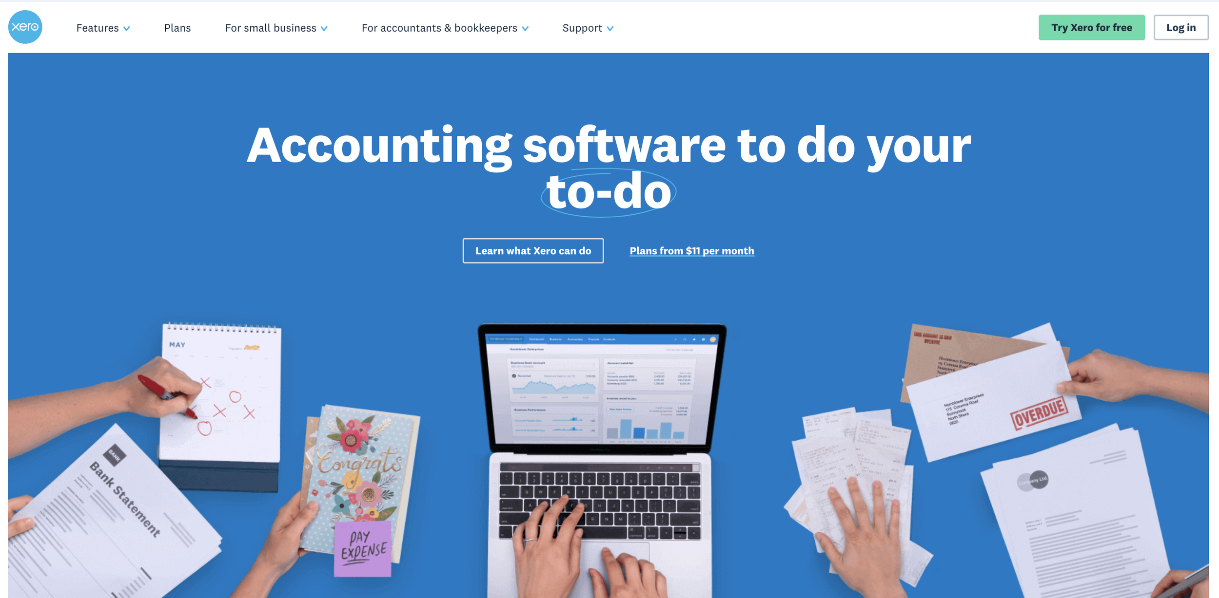
After: The Xero website
Process
I created guidelines for over 20 content types and 30 new templates.
I worked on the content design for core feature pages such as online payroll, online invoicing, bank connections, accept payments, pay bills and more.
I worked on the homepage content and purpose document, so that all of the global regions had guidance around component usage and placement, along with content design best practice.
Results
Creating guidelines and templates sped up the process for writers, so that they weren’t creating bespoke page structures each time they created content.
Revising the content and structuring it into reusable pieces sped up the process of updating content. Content was stored so that there was one true source, which meant any updates to that area updated the content everywhere it appeared, saving many hours of work.
Creating component guidance ensured everyone in global teams were on the same page when it came to content presentation and structure, ensuring a consistent and scalable experience across the site.